Hi Bobby.
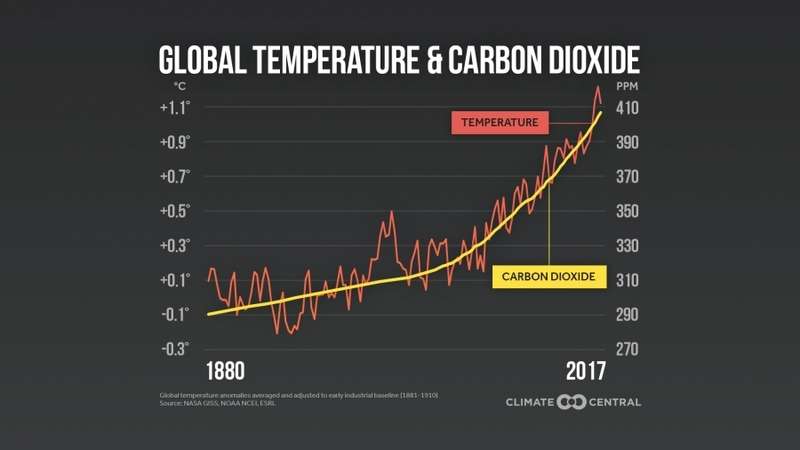
Brian published it on page 4 of the "Climate Change" topic. His graph displays a yellow line which purports to display an averaging out of temperature values, which did not display the reduction in temperatures which occurred from 1940 to 1970. It was this 30 year temperature reduction that had climate scientists at the time thinking that the present 1000 year warming cycle had ended, and that Earth was now entering another scheduled ice age.
1970s Ice Age predictions
-
Bobby
Re: 1970s Ice Age predictions
Bogan wrote: ↑Sun Jan 05, 2020 5:44 amHi Bobby.
Brian published it on page 4 of the "Climate Change" topic. His graph displays a yellow line which purports to display an averaging out of temperature values, which did not display the reduction in temperatures which occurred from 1940 to 1970. It was this 30 year temperature reduction that had climate scientists at the time thinking that the present 1000 year warming cycle had ended, and that Earth was now entering another scheduled ice age.
This one - so Brian was posting fake graphs?
-
Bobby
Re: 1970s Ice Age predictions
It's fake news folks.
-
Bogan

- Posts: 948
- Joined: Sat Aug 24, 2019 5:27 pm
Re: 1970s Ice Age predictions
Brian Ross did not deliberately submit a graph which he knew to be false. These sorts of inaccurate graphs are routinely submitted on pro HIGW youtube sites to fool the easily fooled. What I accuse Brian of is not taking an objective approach and examining both sides of the argument to figure out which side is telling the truth. Another now infamous inaccurate graph was the "hockey stick" graph invented by HIGW luminaire Professor Michael Manne which conveniently air brushed out the entire Medieval warming Period. This false graph is now in school text books around the world to indoctrinate school children into this new religion.
You do not have the required permissions to view the files attached to this post.
-
Bogan
- Posts: 948
- Joined: Sat Aug 24, 2019 5:27 pm
Re: 1970s Ice Age predictions
+
The top graph is the infamous Hockey Stick graph and the bottom graph the real graph displaying global temps for the last 1000 years. The top graph is obviously false because most people who have any appreciation of history know about Greenland and the Medieval Warm Period.
When you see graphs like this submitted by the HIGW alarmists you know that somebody is deliberately telling porky pies. An intelligent person would therefore begin to examine any other "evidence" presented by alarmists with scepticism and deep mistrust.
You do not have the required permissions to view the files attached to this post.
Who is online
Users browsing this forum: No registered users and 4 guests